MODULE: Gestalt theory
Step 09 of 16: Proximity
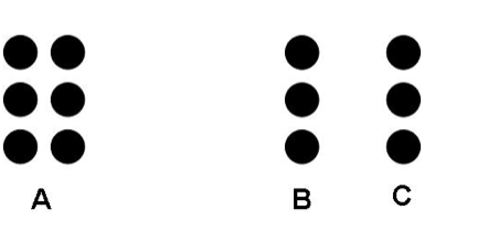
The fourth Law of the perception of grouping is at once the easiest to understand and also the least observed among new Designers. The Gestalt Law of Proximity is easiest to understand because it asserts that elements that are physically close will be grouped together more easily than those further apart. This is practised by children when they group and separate lego by colour in small clusters, by adults that file their affairs in piles and folders on their desks and the elderly who sort their memories into boxes of sentimental photos and letters. Things that are related are put close together. There is not much point going into detail about why the image below demonstrates the virtue of grouping dots horizontally by distance even though vertically they remain uniform across all groups, it is a common enough understanding;

What is worth mentioning here is that the same understanding of the importance of proximity for grouping, while it is understood by Designers for what it accomplishes, is often poorly implemented in practice. This is usually a result of new Designers trying to fit as much onto a page as possible, thinking if they leave anything out it will be worse than an overly congested Design. What results is the lack of empty or negative space. Without negative space everything is located close to everything else and the ability to group things that share a common purpose or value becomes compromised. It cannot be sufficiently emphasised in every Design book and article that less is more.
The Law of Proximity is one of the most critical observations of good Information Architecture and visual heirarchy. It is of the highest importance that Designers properly re-evaluate their compositions as having and successfully demonstrating good grouping through the close proximity of related elements. That necessitates empty areas too.
Note: you may encounter some other sets of Gestalt Laws, among them a Law named "Uniform connectedness" which provides grouping within a bounding-box or other boundary. This is a strong association of grouping, but should be adopted with caution: using a bounding box to group items adds visual noise to a composition. Consider how to accomplish the same without adding; it may require subtracting instead, introducing more space and better utilising Proximity.